
Does the Danielson Rubric Make Us Better Teachers?
Does the Danielson Rubric improve teaching? Maybe it’s an unfair question. After all, it’s a rubric, not a training program. But…

Every experienced educator knows how to juggle. We may not actually be throwing balls in the air, but we catch whatever is thrown at us. Grade level standards to cover? Check. Struggling students to support? Check. Enormous pile of quizzes or papers to grade? Check. Use student data to inform instruction? Maybe not.
As teachers, we spend our work days with our students. In order to be fully present, we put off paperwork until after school hours. According to a 2012 study by the Gates Foundation, the average teacher works 10 hours and 40 minutes per day!
Lately, a lot of attention has been given to the importance of student data. But what about studies on whether student data actually improves instruction? A quick google search brings up hundreds of articles on using data to improve instruction. But many educators have expressed concerns about the challenges in using data effectively.
I’m a big believer that student data has the potential to improve the quality of instruction. But there is also a risk that the additional time spent gathering data distracts teachers from work that more directly benefits students. In a recent article, I addressed some of the reasons that formative assessment can fail. Part of the issue is that we tend to focus too much on where students aren’t proficient, rather than building on areas of proficiency.
In order to actually improve instruction, though, it’s also critical that teacher time is focused on interpreting data, rather than generating it.
I remember mentoring a 5th grade math teacher who was in the midst of a unit on multiplying fractions. As she demonstrated procedures on the board, I could see that many students were confused. As they began working on practice problems, they lined up at her desk to ask questions. One by one, she demonstrated how to perform the algorithms. Finally, she went over the practice problems on the board, while the students corrected their mistakes.
As this went on, I circulated, asking students questions. It was clear that many did not fully understand the concept of a fraction. Few could draw a scale model of ¼ or ⅗. When the teacher and I debriefed, I suggested she address these foundations in upcoming lessons.
In response, she pulled out a mammoth data binder. She “proved” that her students had not only mastered all the foundational concepts, they also were proficient in several fraction operations. The binder contained page after page of data tables. She had dutifully recorded and coded every student’s answer to every question from every quiz throughout the year.
I mentioned that ‘Samuel’ had trouble explaining how to add 1/3 plus 1/3. She flipped through the binder and reported that he had correctly answered 16 out of 23 questions on adding unit fractions. We discussed another student, and again she flipped through the binder to demonstrate that she had identified that student’s strengths and weaknesses.
I could only imagine the endless hours it had taken her to log every student response in this data binder. Just think of all the ways she could have used this time to better support her students: one-on-one conferences, planning engaging lessons, small group instruction, the list goes on.
Somehow, all of this effort was leading her to completely misinterpret her students’ level of understanding. So what went wrong?
I realized there were two key issues with how data was being used. The first issue was around the way the data was collected. The second related to how she had aggregated her student data.
Data is a numbers game – in more ways than one. Any statistics 101 course teaches the importance of sample size. Too few data points, and we can’t really have confidence in our findings.
Many teachers feel that they know more about their students than what data can tell them. There is actually quite a bit of truth in this. A language arts teacher who regularly reads her students’ writing, understands their abilities in a way that data can’t replace.
We must acknowledge that data provides just one of many perspectives on student skills. I’ve often come across data that seemed off, based on what I already knew about my students. That discrepancy told me I had to take a closer look. Sometimes I confirmed what I already knew. Other times, the data gave me a new perspective.
The point is that even robust data sets are only one part of the picture. Small data sets are basically useless. And any data set that can be gathered by hand will never be large enough to be useful. My first choice is always to gather data through an online platform. Some of my favorites are Khan Academy for math, NoRedInk and Vocabulary.com for language arts. These sites ask students questions and record the results – no grading time needed.
The only drawback is that students need devices to work on a platform. There are also apps, such as ZipGrade, that gather data by scanning bubble sheets. I haven’t used these myself, but I have heard that they are helpful.
Assuming we’ve gathered student data efficiently, the next step is to translate individual data points into something meaningful. This is what’s called data aggregation, another key step in the data cycle that can’t be effectively done by hand.
Aggregation is basically a fancy word for organizing your data. By using technology to handle data, we can quickly adjust how our data is grouped. For example, I may want to look at an overview of an entire class or an entire school. Next I may choose to zoom in on an individual student, or sort data by a certain skill or standard.
It almost goes without saying that interpreting data is much easier in visual form. Here again, in a split-second, an online dashboard can generate graphs and charts that would take hours to create manually.
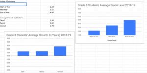
Sometimes I want to see data grouped by the entire class. This can show me how far my class has progressed through a grade level, or the average time spent on the platform last week.
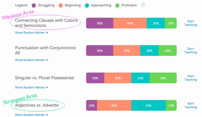
Other times, I like to zoom in on individual students to check in on their progress or find areas areas where they are struggling.
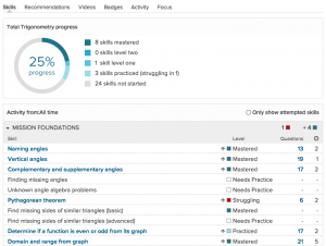
I also like to view data by skill or standard. This way, I can get a sense of whether I should teach a topic in a whole group or small group setting. It also allows me to group students and choose which lesson to teach each group.
While using student data to drive instruction can add to teacher workload and distract us from the human side of teaching, that doesn’t have to be the case. Good use of data shouldn’t involve additional grading on the part of teachers – in fact, it should replace some of the grading teachers are already doing.
If you’re serious about making data work for you, we can help. Our data coaches can answer all of your questions and help you set reasonable goals when it comes to student data. Get in touch to schedule a consultation.
For math teachers, we also have an online course, Khan Academy Basics. It includes lesson plans, instructional videos, and reproducibles. This one week course will get your class up-and-running on Khan in just minutes a day!
We wish you success in using student data to inform instruction. Just remember, the data works for you – not the other way around!
Does the Danielson Rubric improve teaching? Maybe it’s an unfair question. After all, it’s a rubric, not a training program. But…

Do they improve the classroom experience or interfere with learning? Here’s how to decide if calculators should be allowed in your math class.

Your curriculum is NOT your textbook. Here’s how to create curriculum plans that save time, while improving student engagement and achievement.